Arxiv.org is the single largest open repository of open research on the Internet. However, it’s poor usability and antiquated design impacts its impact and relevance to the future generation of researchers. The goal of this project was redesigning the Arxiv.org User Experience in order to enable much easier content navigation and discovery, as well to ensure project’s ongoing relevance in the face of increasing competition from commercial portals.

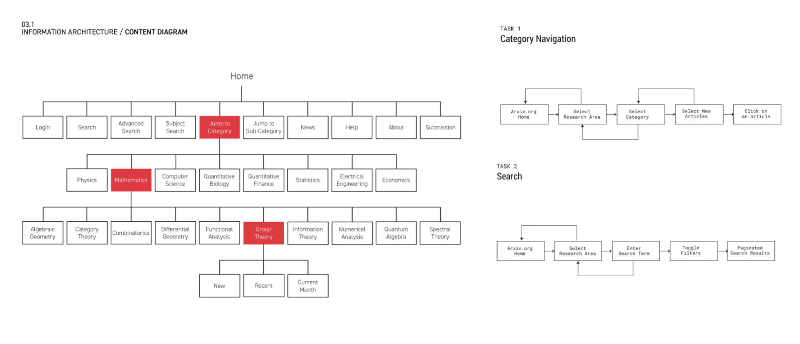
UX Redesign of Arxiv.org demanded intensive analysis and reorganization of core user interaction flows. This was done in conjuction with the process of interviewing all the relevant stakeholders, both at the Arxiv.org management side as well as on the side of end-users. Both senior faculty and junior researchers were consulted in the process of identifying critical use-cases.
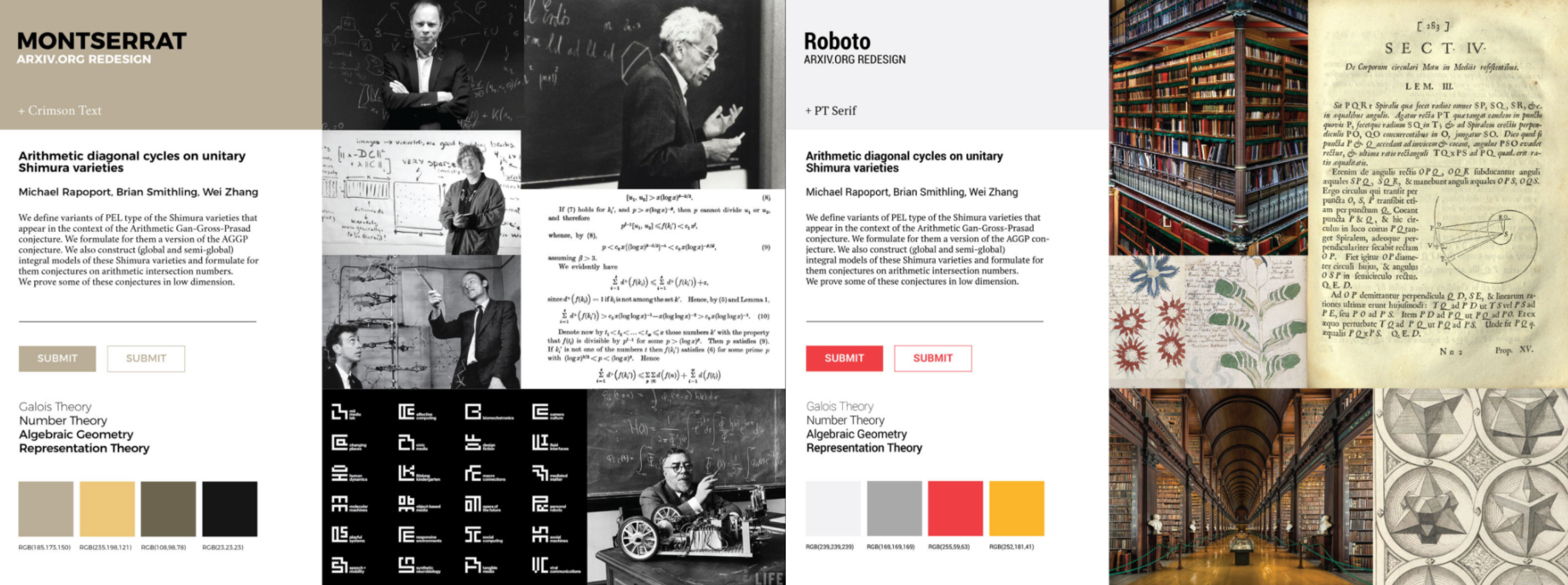
In order to facilitate the development of the new style, multiple directions have been explored, drawing from the key areas of interest for the target audience. In this process, two main directions emerge - one highly technical and inspired by the field of mathematics and the other inspired by humanitics and the library aesthetics. Both styles have been fully developed and tested with the target audience.


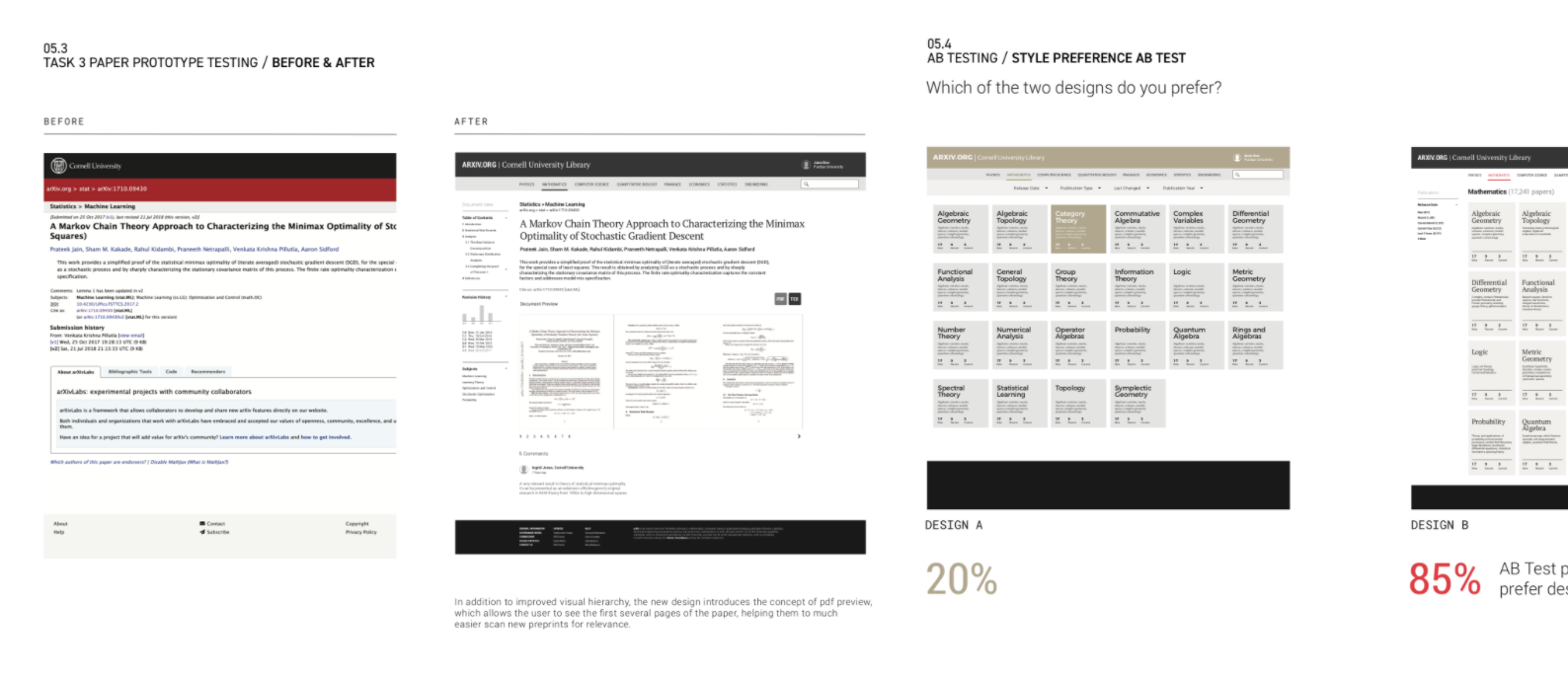
UX Testing has been a key part of the process of this redesign project. Wireframe concepts have been continuously tested against existing pages, in order to ensure that improvements in aesthetics don’t come at the price of reduced usability. In addition to this process, a separate AB testing process has been conducted to facilitate selection between alternative design languages on all pages.
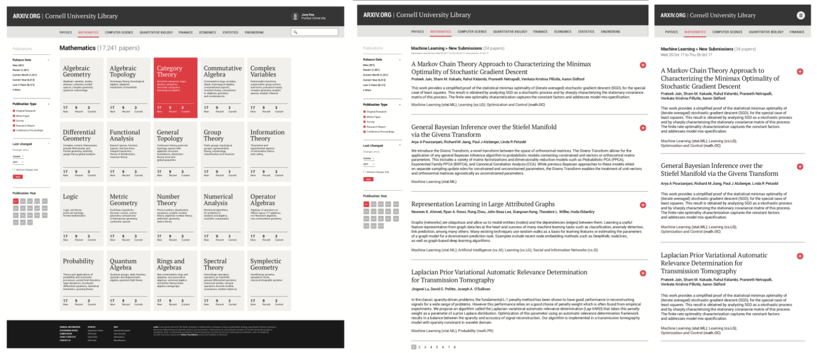
New design not only improves on the visual look & feel of the website, but also unlocks usability of key areas of the website such as category browsing, which previously had seen low usage rates. New design is also responsive, ensuring usability on mobile devices, which, according to our research, represent 40% of all Arxiv.org website visits.
